3 Affordable Interiors Hacks To Brighten Your Home
Looking for design inspiration for your next interior refresh?
Look no further than the wonderful world of TikTok! Don’t be shocked… TikTok isn’t just for mindless scrolling and memes. There is actually an abundance of styling, décor, and DIY advice at your fingertips.
But, if you are as busy as we are, we bet you don’t have endless hours to explore this vast digital design landscape.
Well, you’re in luck! Swoon, the UK’s leading online design-led furniture brand, has scrolled through hundreds of trending interior-led videos to discover the top three favourite styling and décor tips and tricks that TikTok has to offer, so you don’t have to!
Plus, it reveals expert styling advice on how to achieve them in your home, instantly. Who knows, you might just discover your next revamp idea in time for your summer soirees…
Our Favourite TikTok Interior Design Trends
1. Build A Neutral Base
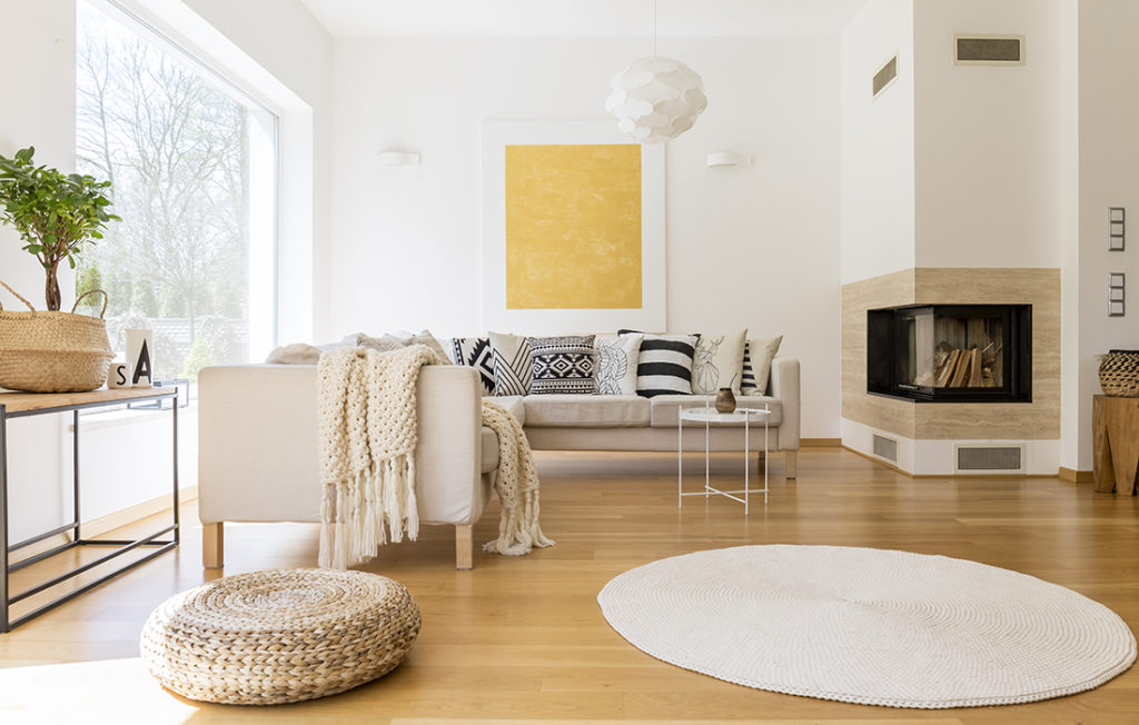
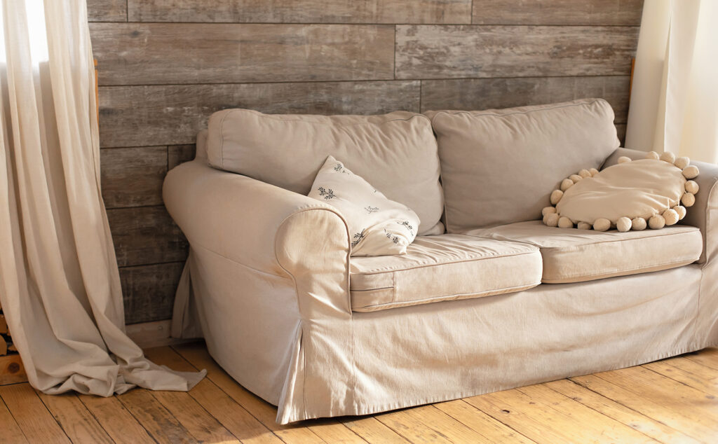
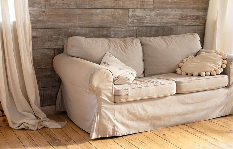
When you are planning a large-scale renovation, or starting a design project completely from scratch, it’s always good to begin with the basics. Your walls, flooring, countertops, and large furniture pieces such as sofas and dining tables should all flow to form a cohesive aesthetic, according to RedInkHomes.
It recommends building a neutral base in your abode, so it can remain timeless and chic, whilst also being easily adaptable if your visual tastes tend to change often.
Sam Baldry, head of design at Swoon, comments, “I love the idea of creating a neutral base to accessorise and embellish. As someone who tends to change their interior often, with constant influences from external factors such as the fashion industry and advertising, for me building a neutral base and enhancing it with bold and daring accessories is the perfect technique to ensure that interior revamps don’t cost an arm and a leg each time.
“For the ideal neutral base, I would always begin with white walls. A crisp, fresh white background is the ultimate base to build your space around. Next, I would decide if I was going to opt for warm or cool tones.
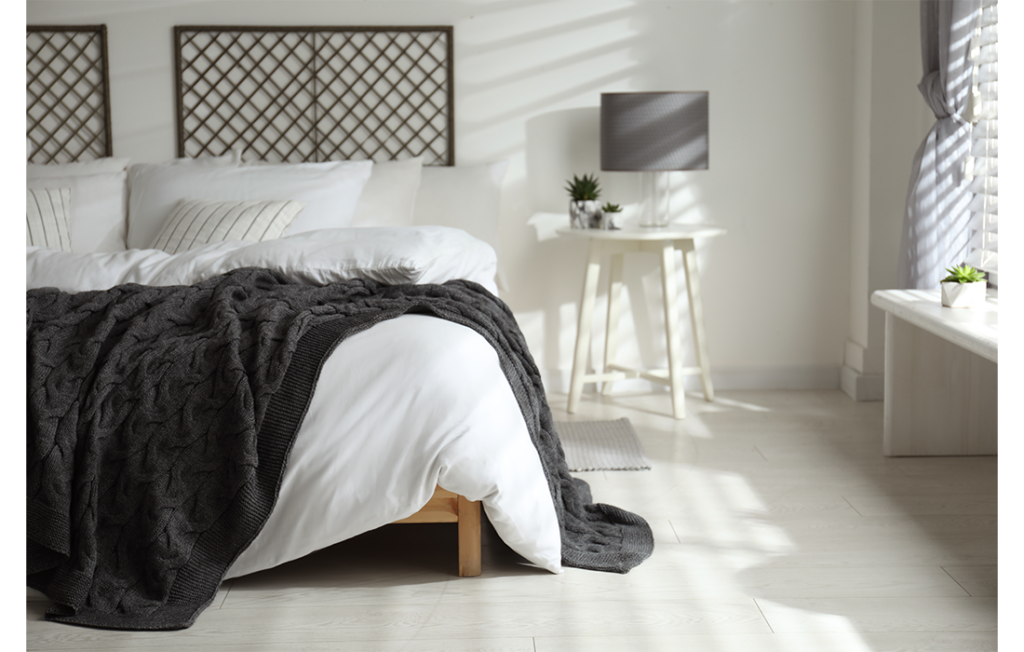
“I prefer cool, so I would go for grey furniture rather than beige – these are the two most impartial base tones. A light grey sofa, grey curtains, and grey upholstered dining room chairs will tie a room together nicely, leaving space for bolder accessories such as wall art, throw pillows, and lighting to truly personalise the space.”
2. Concepts Rather Than Themes
When deciding on an idea for your interior design, TikTok creator arielarts suggests coming up with a concept, rather than a theme.
To explain the difference:
- A theme usually follows certain design rules, using accessories that directly relate to a specific idea, such as shell accessories for a beach-themed room, or flowers for a nature-themed room.
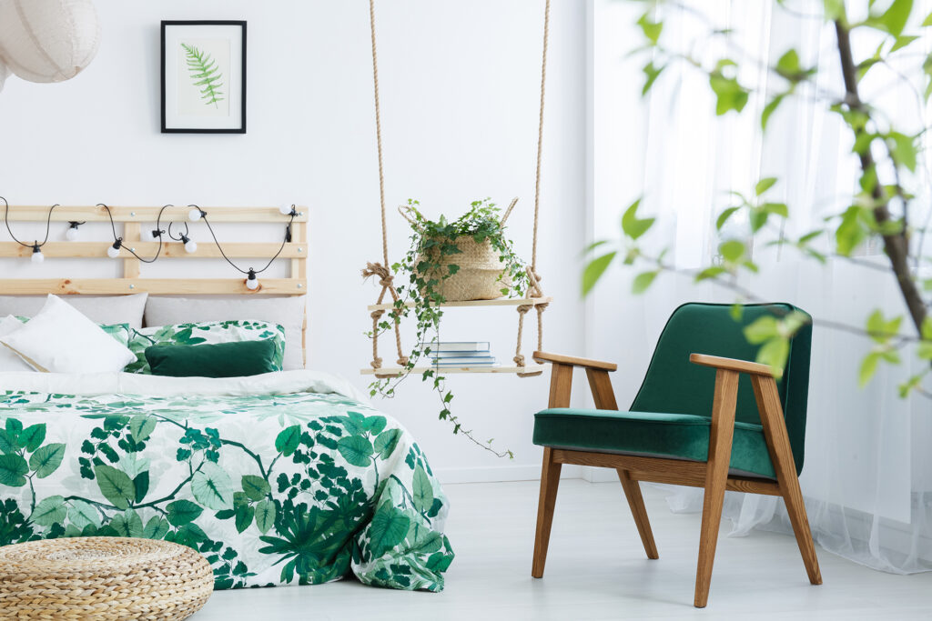
- A concept takes notions and motifs from your design idea, such as adding a driftwood-style sideboard to a beach concept lounge, or a botanical-coloured headboard to a nature concept bedroom. In essence, it’s less factual and gimmicky, and more subliminal and classic.
Sam of Swoon comments, “This is essential to ensure your interiors don’t end up looking like a novelty room in a hotel. To maintain a timeless design, try not to take things too literally.
“A sunset-themed room doesn’t need an actual wall print of a sunset. You can incorporate those stunning tones into the room’s furniture and décor for a more intellectual link – evoking the beauty of the sunset through clever design choices.”
3. Create A Design Juxtaposition
Now that you have built your neutral base and established a design concept (not theme!) it’s time to add some detail and interest into your space. TikTok creator The_AvantGarde suggests using the ‘design juxtaposition’ theory.
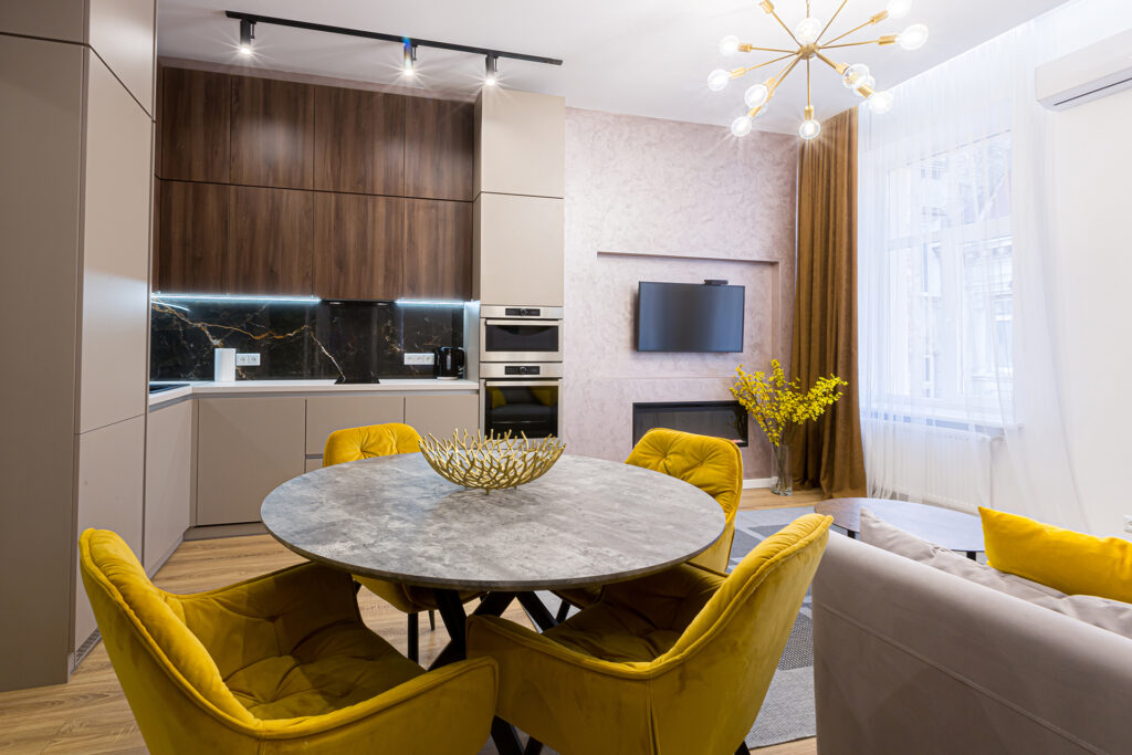
Through adding in contrasting accessories, such as choosing dining room chairs that don’t exactly match your dining table, or bedside tables that don’t match your bedframe, you can create a more interesting, modern space that juxtaposes what your brain thinks should be filling the space.
Sam at Swoon comments, “The juxtaposition design theory is one of my favourite methods to add diversity and intrigue into an otherwise dull space.
“Mis-matching a statement rectangle marble dining table with fern green curvaceous chairs will create a more varied and interesting display, through mixing colours, textures and shapes in an unexpected way.
“The human brain craves to see things that it anticipates, so when a bold design choice surprises it, it becomes fascinating.
“My favourite way to implement the juxtaposition design theory is combining a wooden desk, metal shelving and a boldly coloured textile chair. This simple yet effective design combination incorporates contrasting textiles perfectly to keep the space fresh and exciting, whilst still maintaining a chic, put together aesthetic.”
Inspired? Find out more
So, now you have the best interior design trends that TikTok has to offer, and style advice from Swoon’s experts, which designs will you incorporate into your next home revamp? From building a beautiful base, to crafting a contrasting aesthetic – we hope these ideas inspire you to be bold and take a dive into the world of interior design online.
Take a look for more interiors inspiration.

